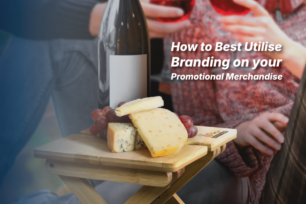
Promotional merchandise can be an extremely effective marketing tool for companies looking to increase brand awareness and foster customer loyalty. However, designing merchandise that seamlessly balances subtle branding with attractive, practical designs customers will actually use can be a tricky balancing act. The key is optimising branding placement and style, so your products promote your brand in a visible yet tasteful manner. Follow these tips to get the most mileage out of your promotional products by harmonising branding and design elements into complementary pieces customers will love.
Choose Practical Items People Will Use
The first rule of effective promotional merchandise is to pick useful items your target audience will want to use on a regular basis. Rather than cheap throwaways, choose practical products like drinkware, bags, lifestyle items and other daily essentials. Useful merchandise gets seen and used more frequently, keeping your brand top of mind. Just make sure to choose good quality products as flimsy materials can reflect poorly on your brand.
Strategise Branding Placement
Where you place branding on a product significantly impacts its wearability. Subtle front or back branding usually works best for apparel and accessories, allowing the item to be stylish while showcasing the brand. Avoid large logos plastered all over the product – you want just enough branding to be visible but not overpower the product design.
Choose Complementary Colours and Graphics
When incorporating branding elements like logos and colours, make sure they complement the product design rather than clash. Ugly or overly blatant branding makes merchandise less desirable. Instead, look for ways to subtly match colours in your logo palette with attractive accent colours on the product itself. This ties branding and design together seamlessly. Also consider your target demographic – youthful brands warrant colourful prints, while sophisticated companies should stick to classic colour blocking or tonal branding.
Keep Text Simple
Resist the urge to plaster your company name, website, and slogans all over promotional products. Too much text looks messy and detracts from wearability. Usually, your logo or a shortened brand name/acronym is all that’s needed. Save additional branding elements like taglines and website addresses for hang tags or packaging. When in doubt, less is more.
Make Your Branding Feel Organic
Rather than just slapping a logo on a product as an afterthought, brands should feel baked into the design organically. For example, incorporate signature brand colours into a pattern or design across your promotional items. When branding ties intrinsically into the product design, it feels purposeful rather than forced.
Quality Over Quantity
It’s better to invest in high-quality, on-brand promotional products rather than mass producing cheap throwaways. Nice merchandise gives a positive impression of your brand as refined and thoughtful. Plus, people are more likely to actively use and keep quality items in their daily rotation. Higher quality items have much stronger branding power long-term.
At the end of the day, smart promotional product design is all about balance. Make your merch stylish and useful first, then subtly weave in branding so it looks slick – not slapped on. Quality and utility achieve brand love and memorability way more than disposable junk. If you need help designing on-brand, lifestyle-relevant merch people get excited about, reach out to the merch experts at REP Merch today!

